My Writing Club members saw it first, then my Content Cracked mailing list…and this week, I launched it on social media too. I’ve got a gorgeous new rebrand! Here’s why it was time for a change, and how the quite magical Natalie Murray of The Edge Brands created the branding of my dreams for me. It’s so much more than a logo…
In the Beginning…
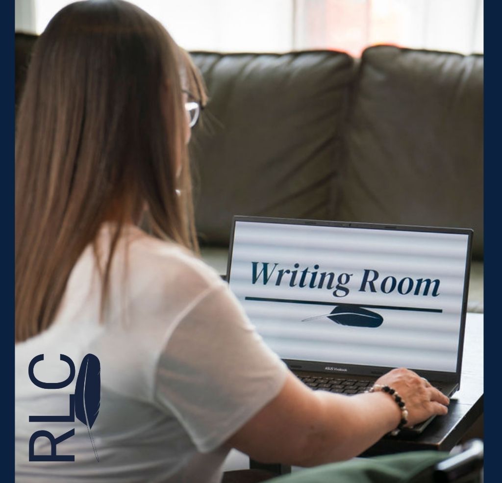
I will always love my first ever business branding. It was created by Mr RLC, who is a graphic design enthusiast. He was delighted to take up the challenge of creating my first logo, way back in 2017. The only brief I gave him was to include a quill – that’s what I wanted to represent me and what I offer.
Knowledge and learning; creativity and expression; centuries of written English; authority and legitimacy – I didn’t think about all this then, but the quill is such a powerful symbol of writing, and all the centuries of communication that go before us. Once it was the only way to get all that inner creativity from the mind and out into the world.
Now, I think I wanted it in my branding because that’s how I see myself, too: a conduit for all those things you want to say about your business – the someone who can help unlock it all for you, and get it out there into the world as you want it

And so that’s what Mr RLC designed for me: a quill in an inkpot, in black and royal blue. The first one wasn’t blue, though – to begin with, we had it with a sort of sepia, but some instinct told me that it was the wrong colour. I didn’t know why, but I wanted blue – so that’s what we did instead, and that’s what I launched with on 1 January 2018.
(I’ve learned since then that blue represents certain qualities in a business, as all colours do – and they happen to be just the qualities I want to communicate! More on this below…)
Later on it had a little revamp and was joined by a globe, in a nod to some of the web design and hosting services I offered for a while; and I updated the font to a slightly clearer one. As I moved my focus back to copywriting, I removed the globe – and the quill alone remained.
Time for a Change…
My first logos are very dear to me indeed, and they have been one of my brand’s cornerstones for as long as I’ve been operating. But once I started working with my fabulous collaborative partners at Elite in a Week (EIAW), I started to look at it with new eyes. I heard the advice that our brilliant EIAW graphic designer, Natalie Murray, gives to our clients; and I see the difference that her professional brand analysis makes to every business she helps. And I wanted that too.
Mr RLC agreed. Blessedly, he is not at all precious about his work, and was in full support when I told him that Natalie was casting her expert eye over my branding, and coming up with some new ideas. The only part I had to keep was that quill – and I put that down in the carefully-crafted questionnaire that Natalie sent me, along with all the other vital ingredients that she needed to get into my brand, and conjure the perfect branding. And she certainly delivered…
Natalie guided me through a methodical – and almost scientific – analysis process, and she took that bundle of information and preference away so that she can apply her quite mystical powers of creativity and instinct to it. The results were perfect. At the start I really didn’t know what I wanted – apart from that quill – but she conjured up a fresh, modern logo that was everything I’d hoped it would be – something completely and utterly ME. As well as my new logo (including that beautiful quill, of course), Natalie devised a colour palette for me that communicates all the business values I want my customers to know about and feel confident in when they work with me: security, reliability, competence, wisdom and experience. Natalie’s extensive understanding of colour psychology confirmed that the blue was indeed the right colour for me – even though I didn’t know why in the beginning! – and the complementing palette is perfect.
Everything was packaged up into comprehensive brand guidelines, that have all been carefully and meticulously designed for me and my business, with my clear target audience and brand image in mind – and include the perfect fonts to match my new logo as well.
I love it, and it makes me beam whenever I see it. The colours – perfect. The way ‘Words’ takes centre stage, with my initials supporting it – perfect. And that quill feather in the ‘d’, holding it all together – completely perfect.
My beautiful rebrand brings everything together from out of my head and into a single image that speaks more than a thousand words. It tells of my business’s past, what I stand for, and how I want my customers to feel when they work with me. It includes that beautiful quill, and all that stands for in my head and heart, and for my clients.
And what’s more, working through this process with Natalie has finally crystalised the strapline I’ve been seeking for a long time:
I always say that it’s very hard to write for your own business – and I can’t lie: I’ve been fumbling around in the dark looking for this one for years! But something about working through the process with Natalie: thinking through my values, my clients, and what really gives me joy about my work, has unlocked it at last. And it fits so well on my homepage, my social media banners, and as a golden thread through everything I do.
My RLC Words rebrand has been so much more than creating a new logo. Natalie is so gifted at bringing out the instincts you have about your business, and turning them into a visual representation of everything you want to say, in one image.
My new look is that complete expression of where I want my business to go, how I want you all to see it – it’s an expression of the future of my business.
Natalie’s running a free branding challenge called More than a Logo in October, and I can’t wait to join and make sure I’m making the most of my beautiful new look! If you’re thinking about breathing new life into your brand, check out her website (The Edge Brands) and sign up for it too. Your brand is so much more than a logo, and Natalie can help you to discover it all.
Discover more from RLC Words: Copywriter and Writing Expert
Subscribe to get the latest posts sent to your email.