
Spot the problems! Does your website hit any of these potholes?
I’ve been a website user since my first look at Amazon in 2001, and I’m a fussy one. I know immediately if I like a business’s website, and it plays a big part in whether I decide to become a customer.
When you’re designing your own website, it can be hard to judge whether you’re on the right track. I’m redesigning my own at the moment, and it’s really not easy being impartial. There are probably all sorts of things that you feel are essential to include in your website – but your users may disagree!
It’s got to have all of the information you want to share with your potential customers, but you don’t want to turn anyone off with an overload of text, colours, pictures and calls to action. How do you know that it’s going to hit the mark, and turn those browsers into buyers?
You can probably think of websites you do like, and they may all look quite different – but the chances are that have managed to avoid some of the following mistakes.
No clear identity – who are you?
If there are lots of different colours and fonts going on across the website, the business or organisation hasn’t really defined a brand image; which can be very offputting. If the business doesn’t know how to represent itself on its own website, you may assume that they don’t understand the importance of a good online presence, which could imply that they haven’t put much thought into being a modern business; and it can shake your visitors’ confidence before they’ve even read what you can offer.
If you have a logo you’re happy with, you’re halfway there. Deciding on the colours, and maybe even fonts, that define your business is a huge step in the right direction for establishing a strong online identity. Your website colours and fonts should be built on those foundations, and should be consistent across all of your pages.
Chaotic layout
Website users like familiarity, and the framing of the homepage content with the header, and perhaps a couple of well-chosen sidebars, should be carried through to the rest of the site. This makes users feel comfortable about knowing where to go next, and how to get back to the Home page when they’ve finished. Decide what your top level pages need to be, and put them up in a menu at the top (your Header menu) – and this should almost always include a Home button. Then keep this menu consistent across every page on your website.
Too much, or too little
Don’t cram too much onto your pages, especially not your Home page. It’s confusing for people landing there for the first time, and you have got to be clear about why your visitors ought to stay on your site. You can add more detail in the pages your viewers will click into, but again, don’t make it too wordy.
But on the other hand, don’t be too minimalist either. Teasers and cryptic one-liners are for your promotional material, and on a website they can be annoying. Your website has got to be a straightforward explanation of what you’re here to do, and how you can make someone’s life better.
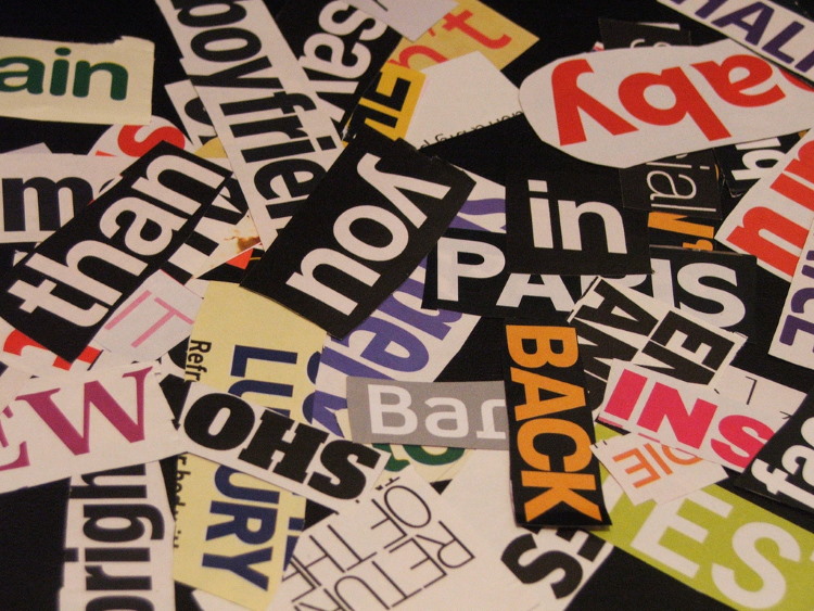
Bad Content and Dreadful Pictures
Well, this bit’s got to be good, hasn’t it? You’ve snared them with a lovely looking site, with consistent colour and font design schemes that complement your logo and brand identity, and now they want to find out more. Informative and well-written content is how you convert your browsers into buyers. This is how they find out what you have to offer, and the sort of business you are. The first part they will get from what you’re saying, and the second they will get from your “tone of voice” – how you speak to your customers.
Are you fast-paced? Dynamic? Exciting? Thrilling? Waiting to take customers on the ride of their lives? Or is your business a relaxing, soothing experience, offering customers a respite from the hectic daily routine? It’s all in the speed and tone of the words and sentences you use.
The images you choose are as important as the words; in fact, your visitors will make their minds up about your site even more quickly when looking at an image, that they will than reading what you have to say – so they’ve got to be good, too. Put some real thought into what you’re using, and ask what you would think of when faced with that image on another site. And don’t forget the quality – a grainy photo is not just an image, it’s the image you present.
Ta-Da! The Result…
Avoid these mistakes, and the finished result should be a website with a recognisable font and colour scheme that is consistent across all pages, and with just the right amount of relevant information, delivered in your business’s tone of voice. Then you will have a website that reflects you and your business, and attract the customers you’re after.
If you’d like to chat about a new website, or perhaps get a healthcheck on the one you’ve already got, I would be happy to help – drop me a line.
Discover more from RLC Words: Copywriter and Writing Expert
Subscribe to get the latest posts sent to your email.